Powering Scalable, Accessible & Unified Product Design
Background
Eptura faced challenges with fragmented design practices and inconsistent user experiences across its platforms. Designers and engineers often worked in silos, leading to inefficiencies and misalignment.
Overview
Evo was created to unify teams under a shared system. It streamlined workflows, improved accessibility, and brought consistency across platforms. This case study shows how Evo accelerated development and improved collaboration.
Evo Design System


Problem
Where Teams Struggle Most
Fragmented Ecosystem Slowed Growth
With nine digital products built on a patchwork of frameworks—ranging from React and Angular to ColdFusion and Xamarin—the organization lacked a consistent UX foundation. Design patterns were inconsistently applied, components were rebuilt from scratch, and brand experiences varied across platforms.
Operational Inefficiency Hurt Velocity
Without a centralized design system, teams struggled to ship consistently and quickly. UX decisions were often reactive rather than strategic, leading to costly redesigns and rework. As support tickets mounted and development cycles grew longer, it became clear that a scalable, unified solution was needed.
Inconsistency
Users encountered drastically different interfaces and behaviors across platforms, damaging trust and brand cohesion.
Duplication
Teams frequently rebuilt the same UI components from scratch across different products, wasting time and creating inefficiencies.
Misalignment
Designers and engineers operated in disconnected systems, leading to misalignment and delayed delivery.
Solution
Creating a Shared Design Language
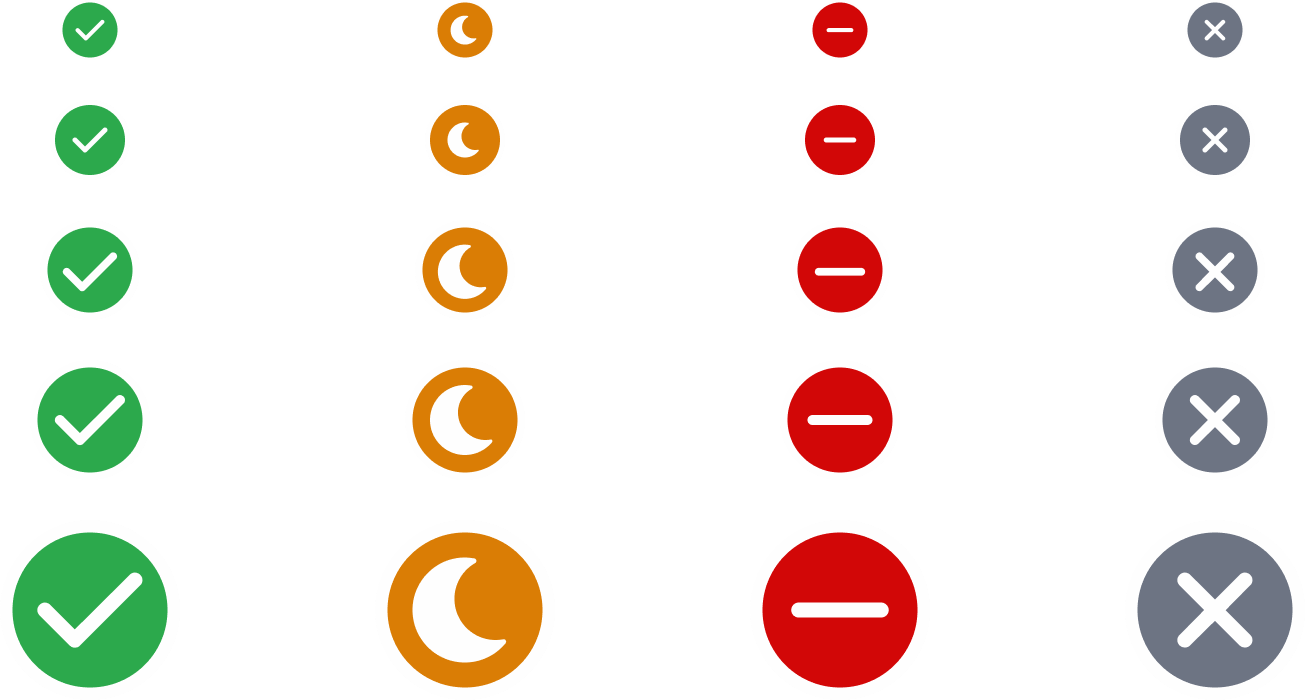
Built-in Accessibility
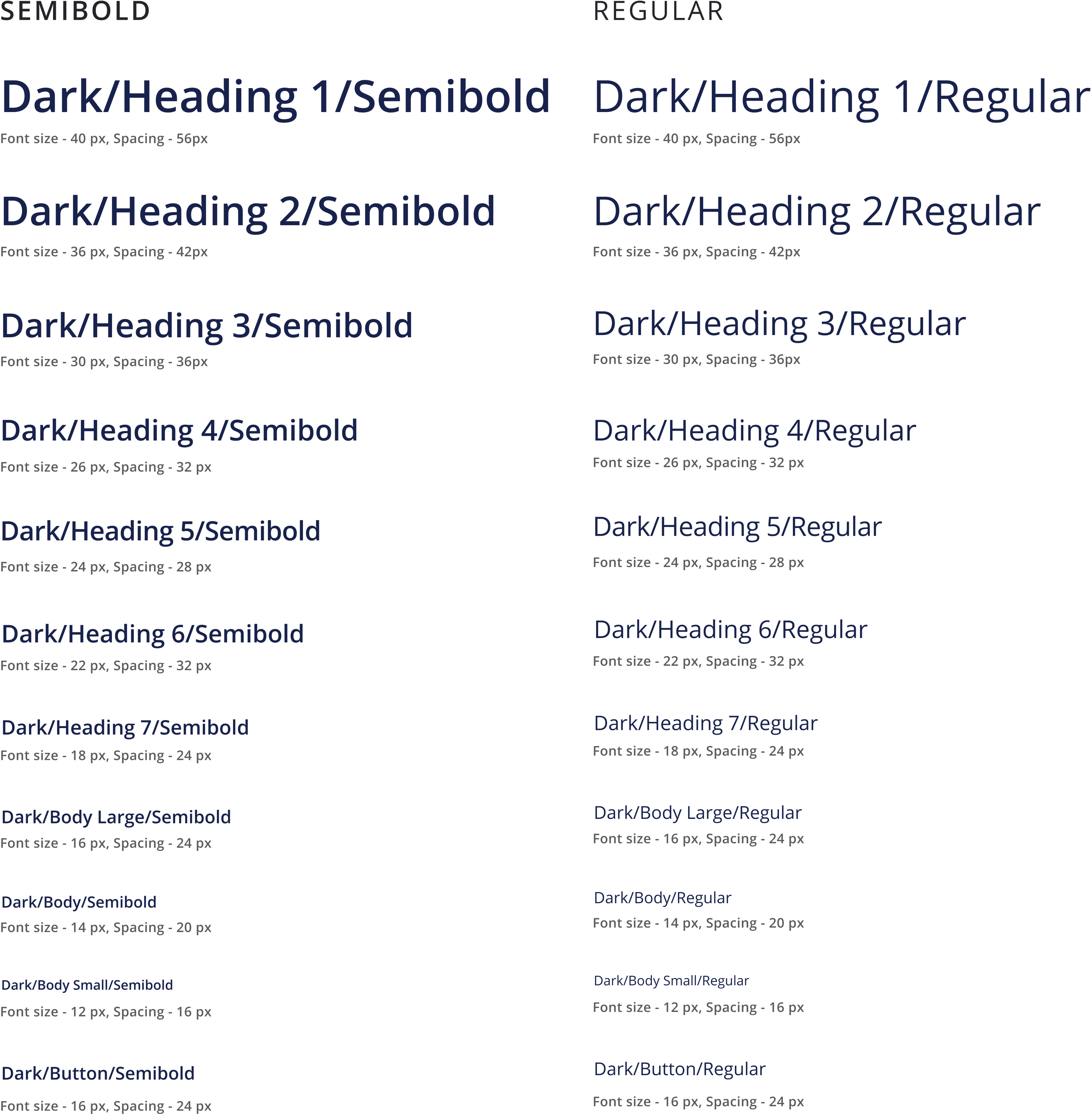
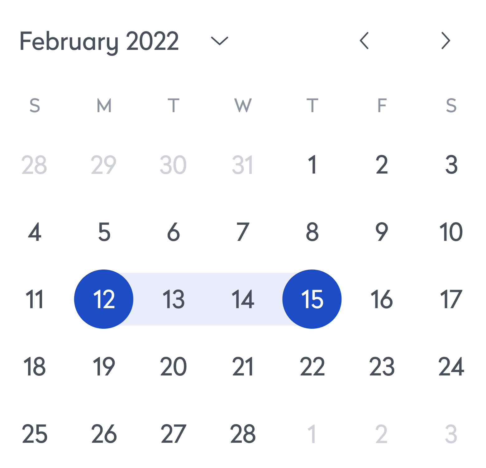
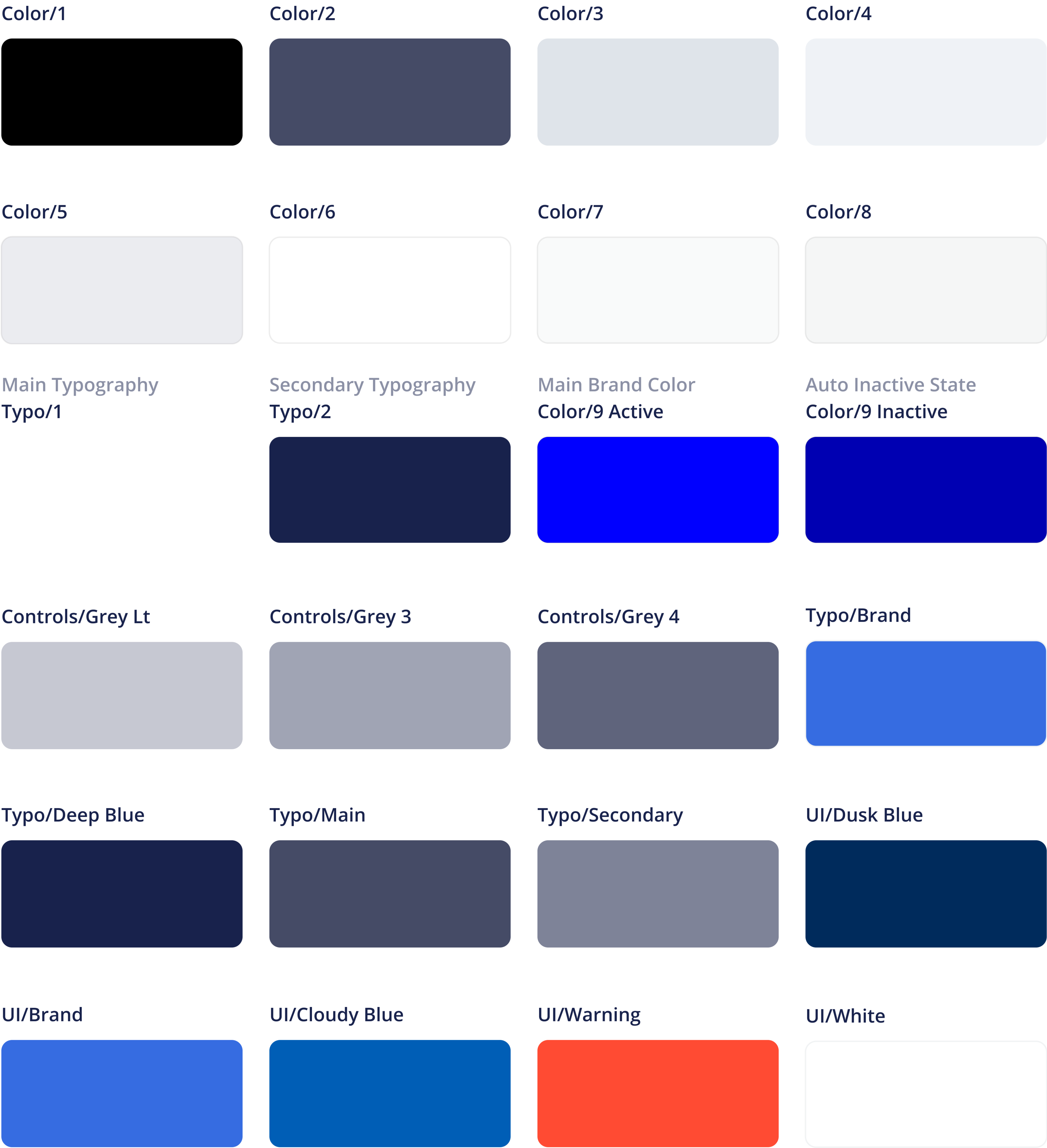
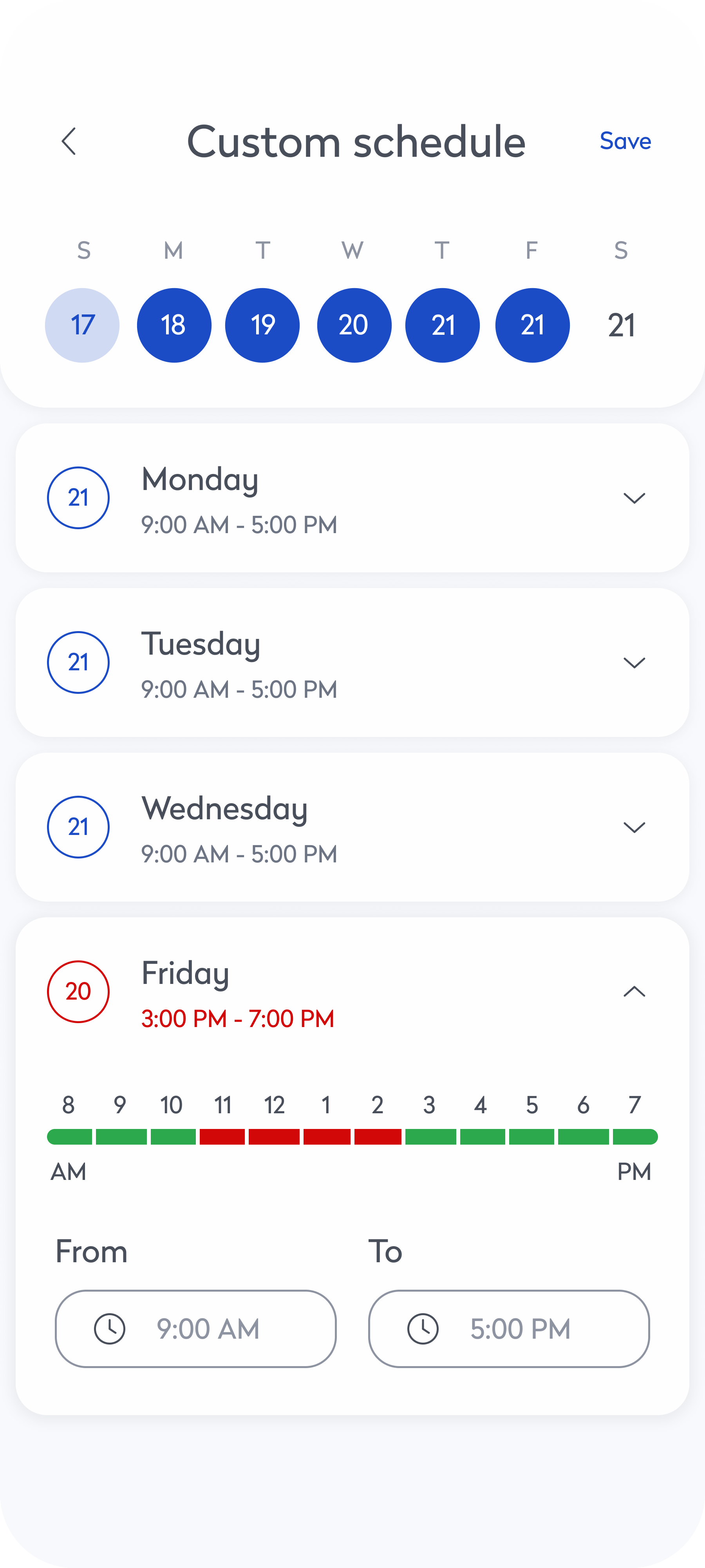
Accessibility was embedded from the start, with every component built to meet WCAG 2.1 AA standards. Color tokens were designed with proper contrast ratios, typography followed scalable and legible guidelines, and icons included descriptive labels for screen readers. Semantic markup and full keyboard navigation were baked into every pattern. Automated accessibility testing was integrated into the workflow to catch issues early, reducing reliance on manual audits and making it easier to consistently ship inclusive, accessible features.

Color/9 Active

Typo/1

Typo/2
Main Brand Color
Main Typography
Secondary Typography

Color/7

Color/6
Color/5
Color/3
Color/2
Color/1

UI/Brand

UI/Warning

UI/Cloudy Blue
Background/Grey 1
Background/Grey 2

UI/White
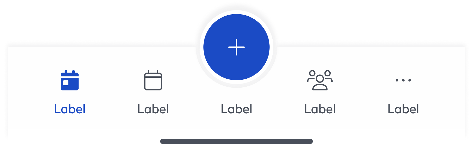
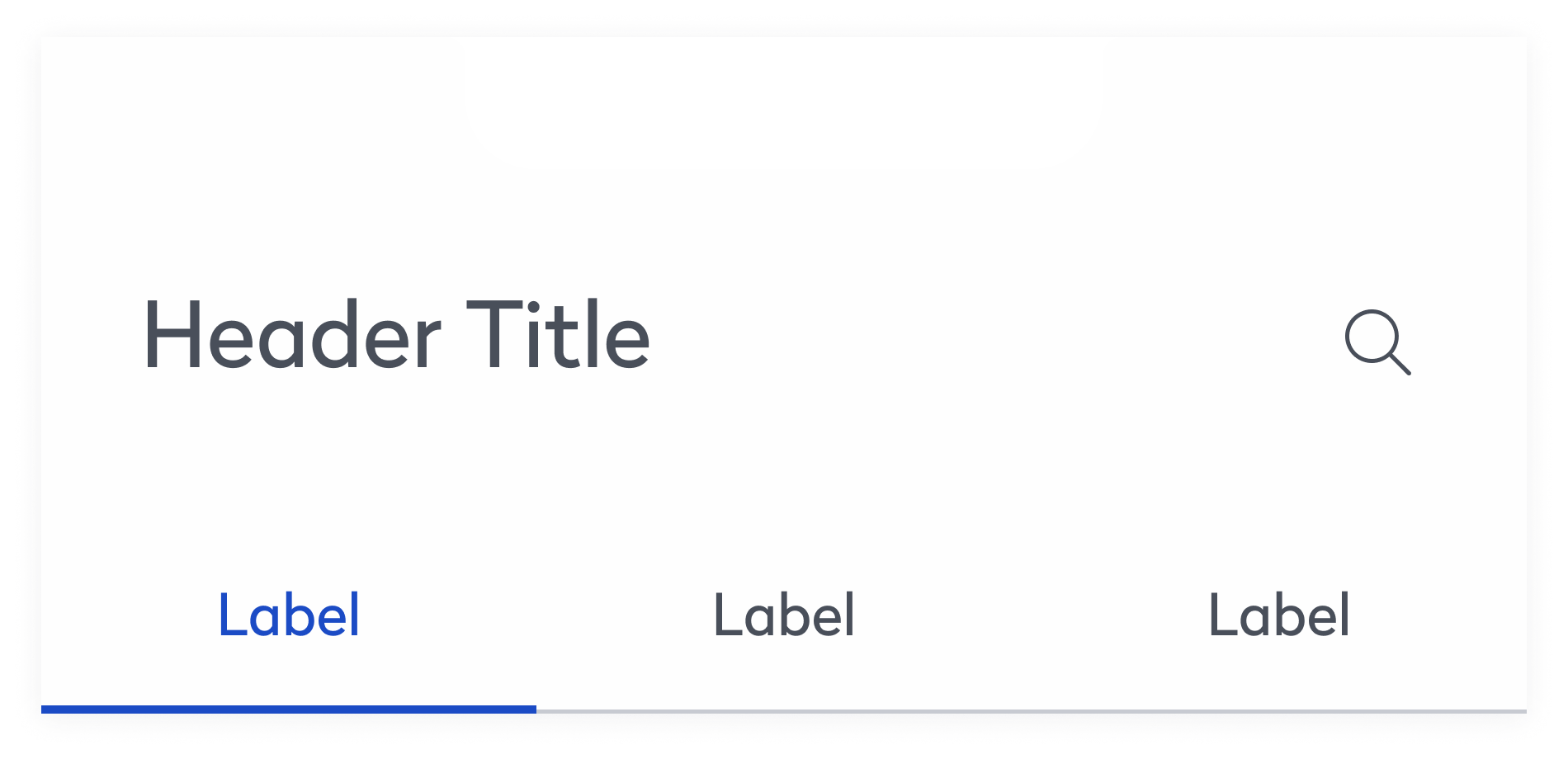
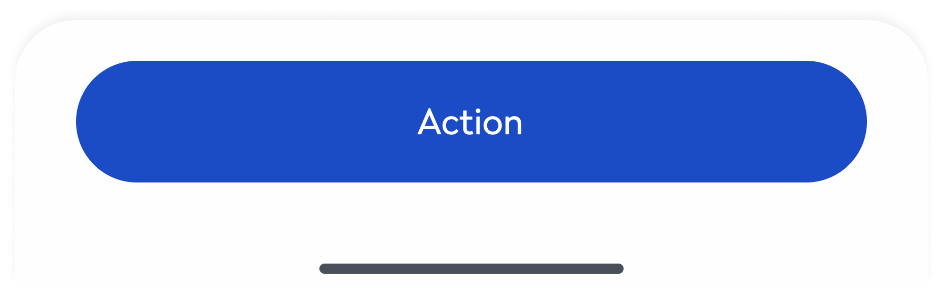
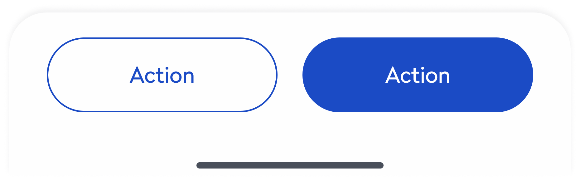
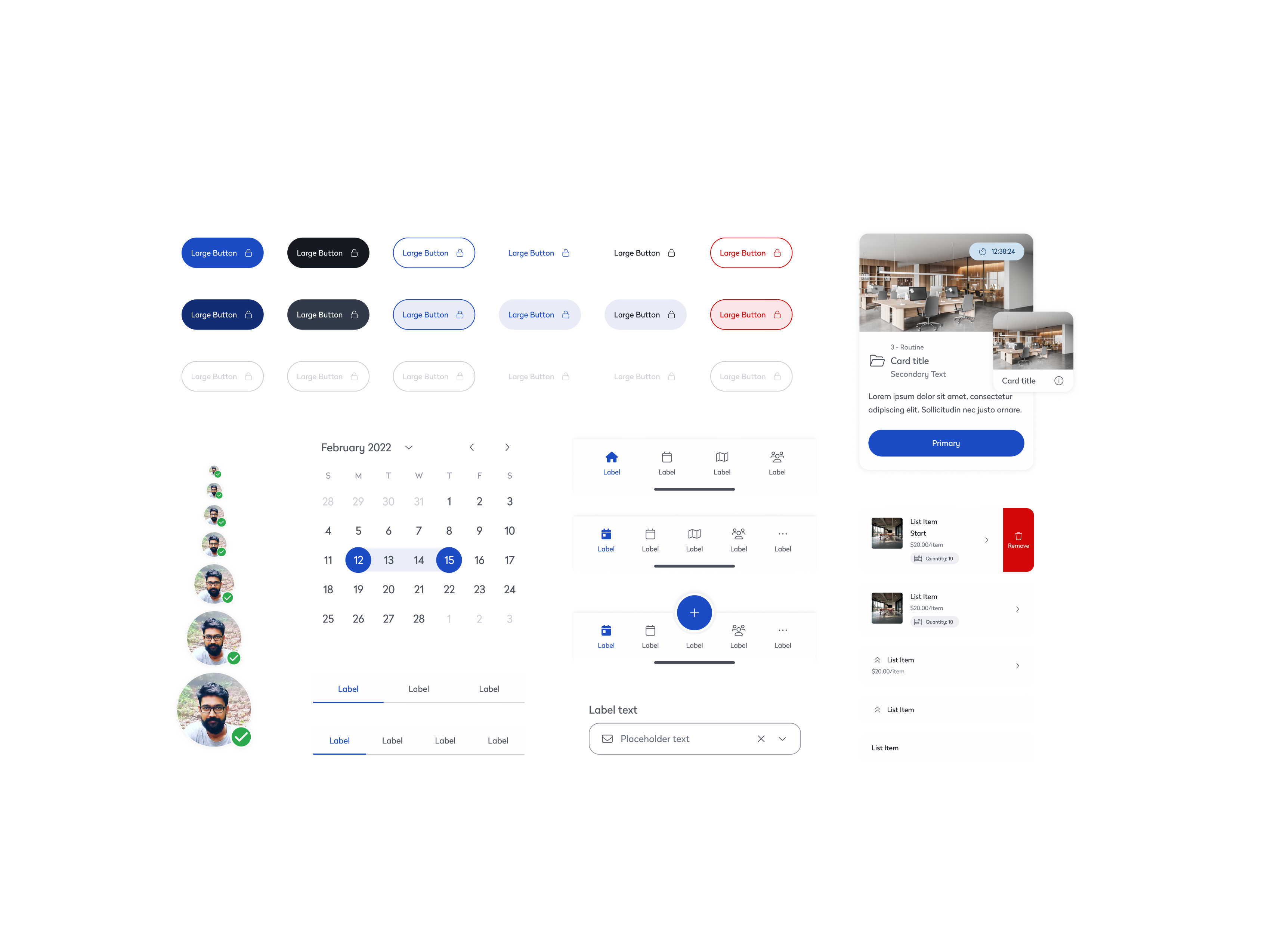
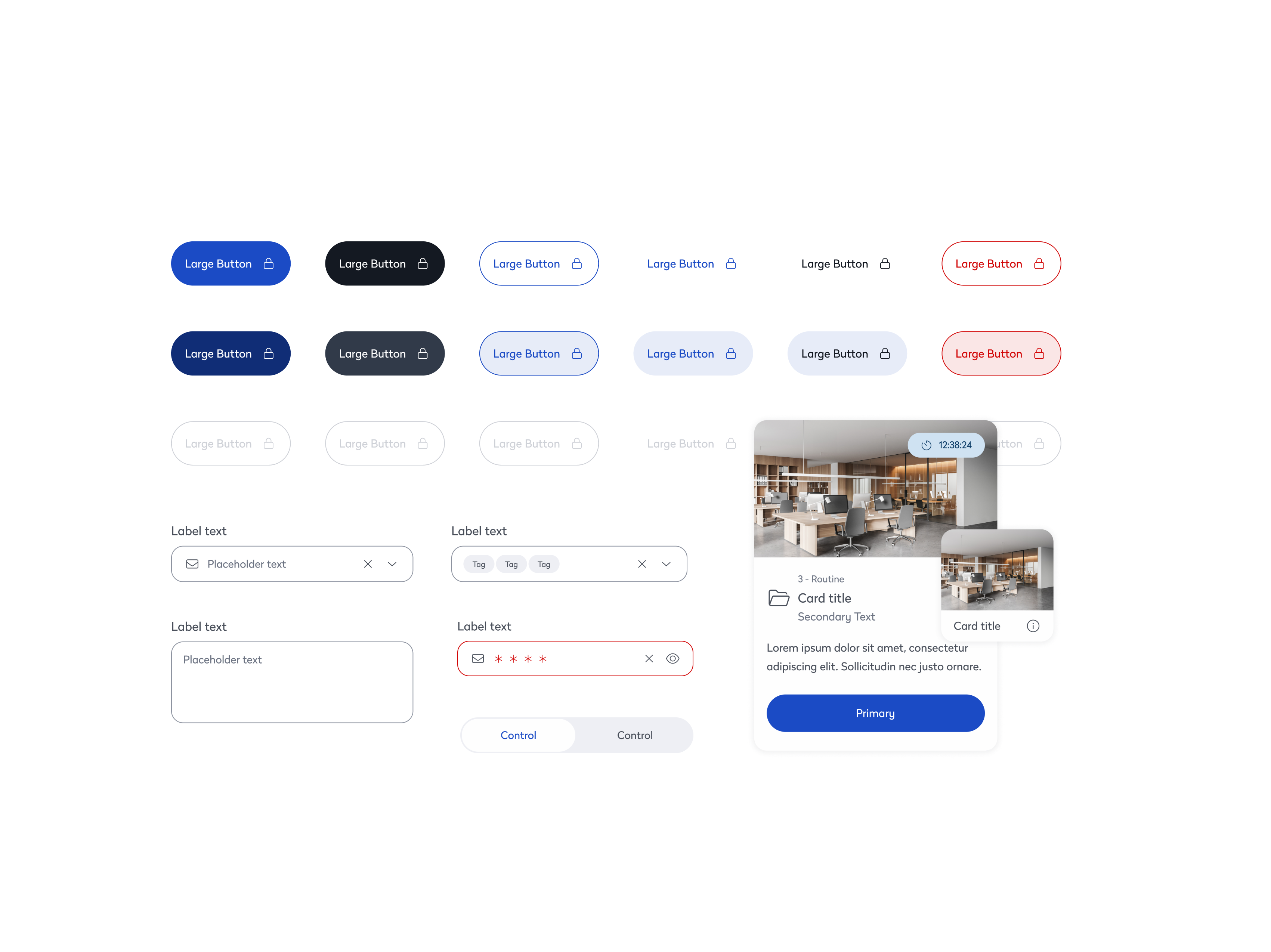
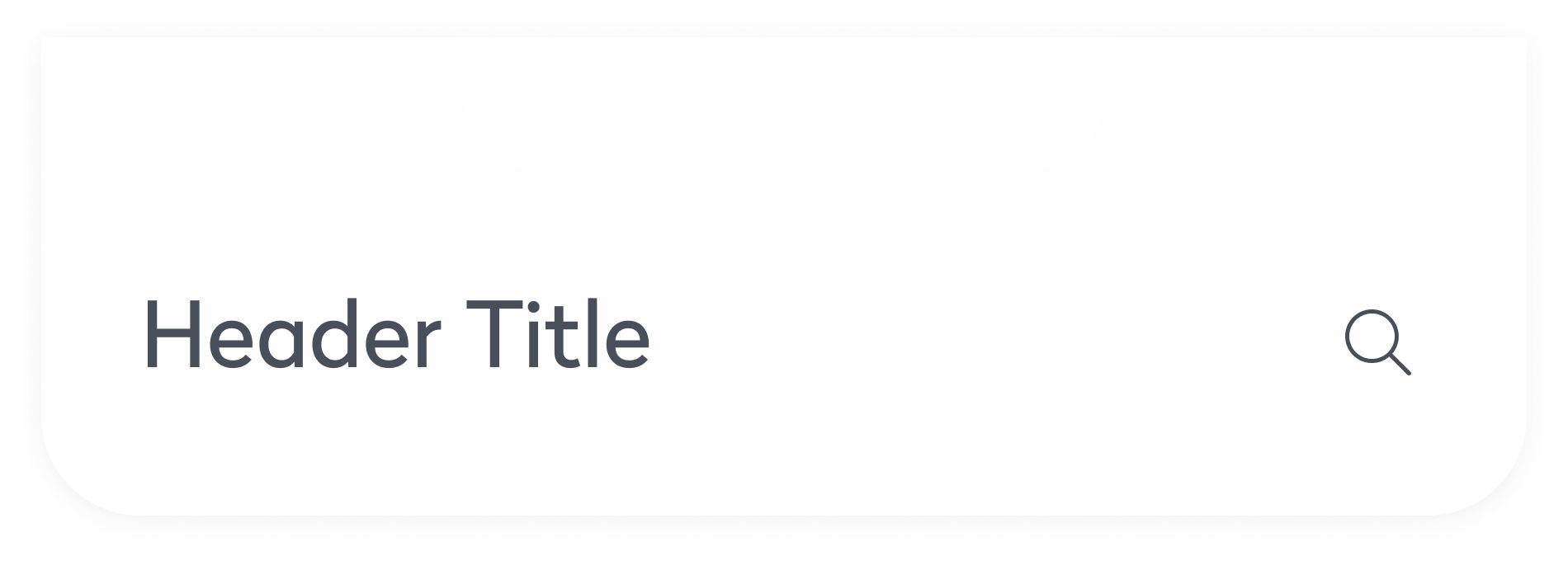
Consistent Design Elements
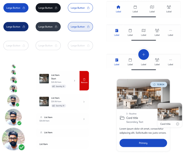
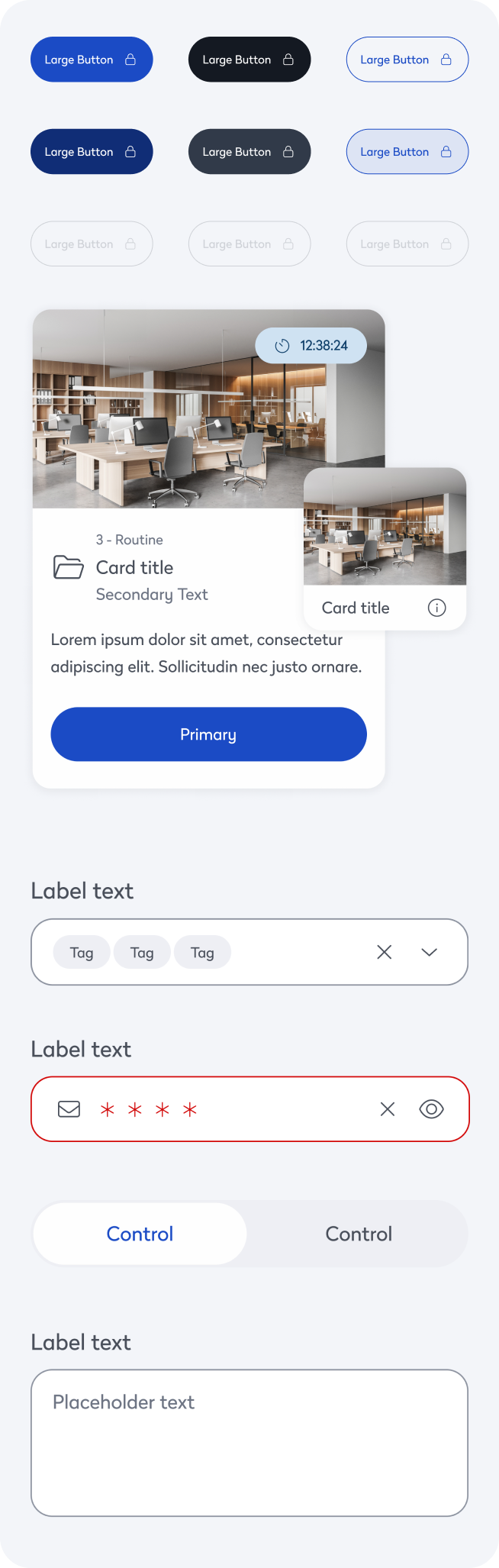
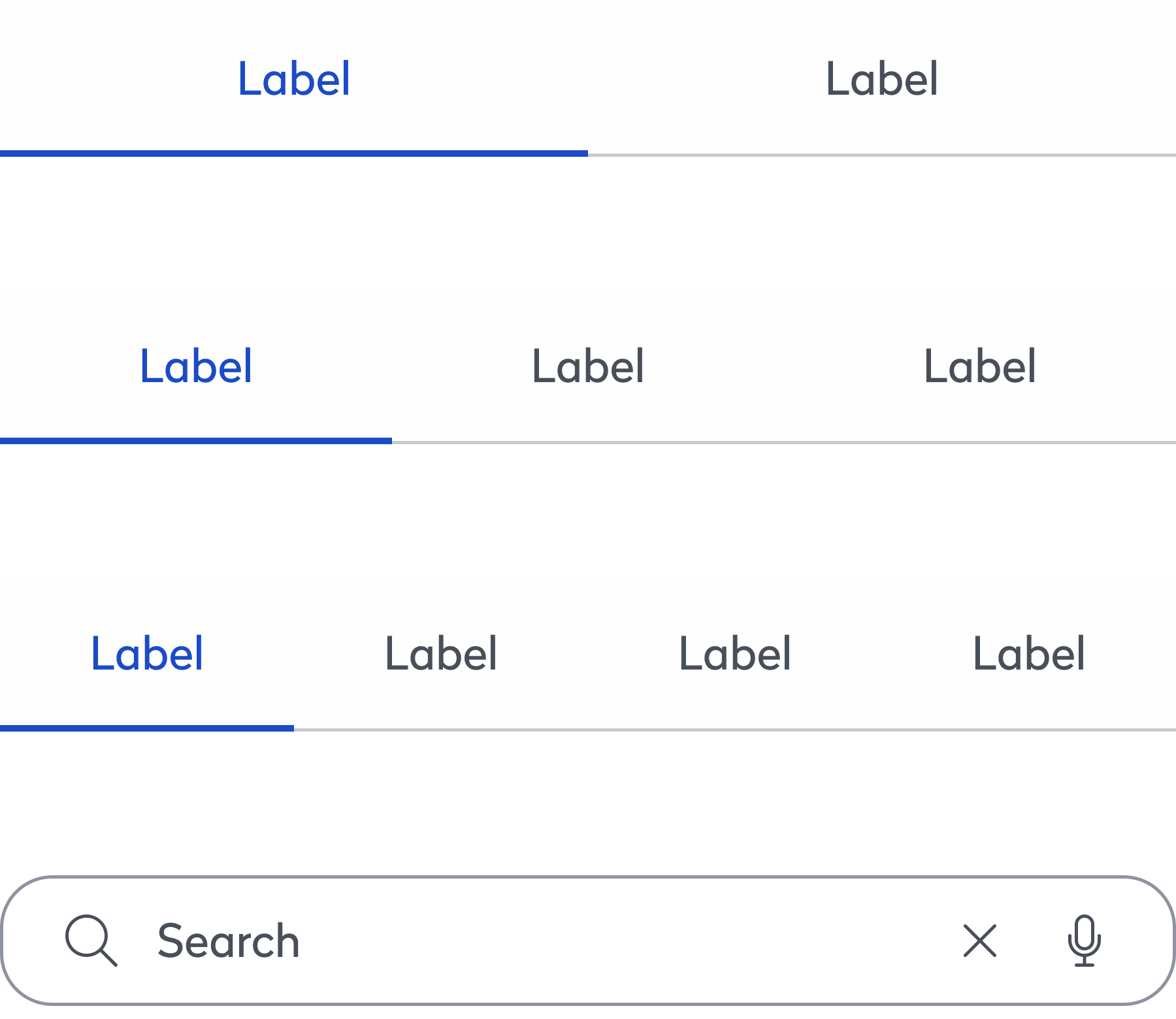
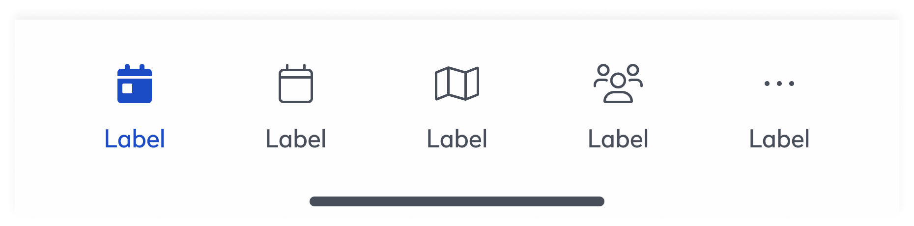
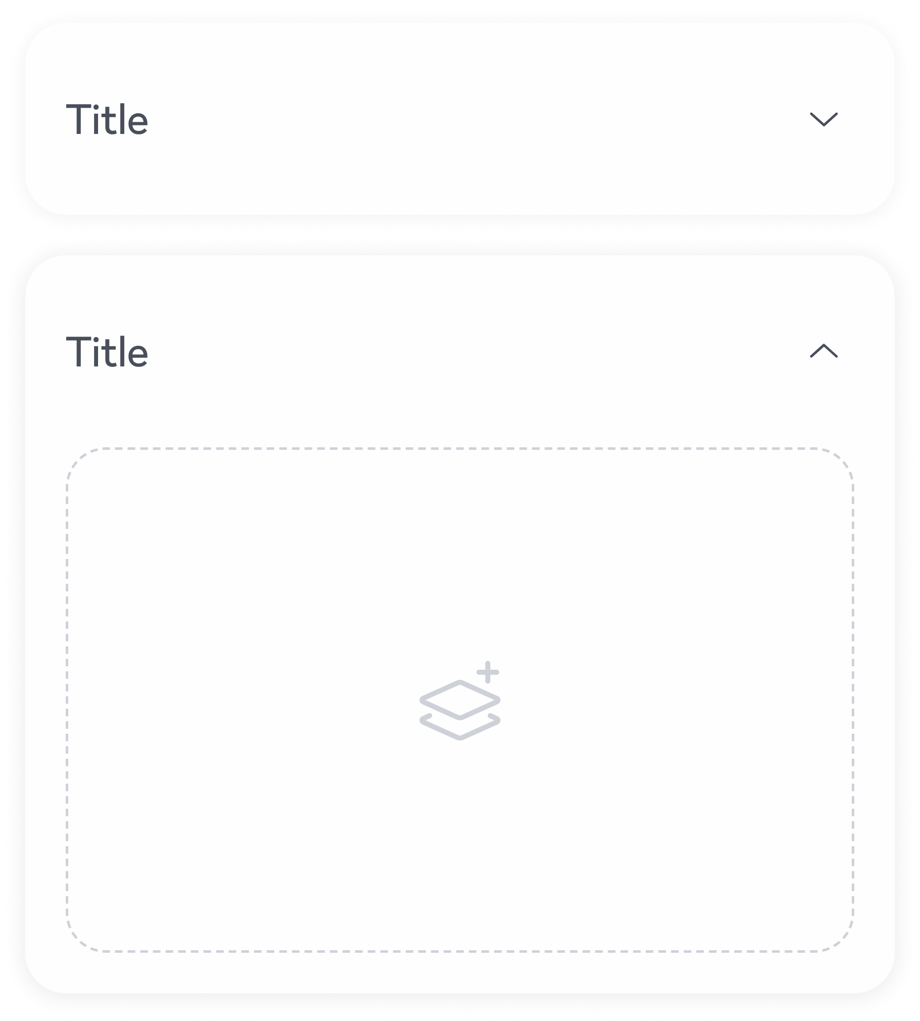
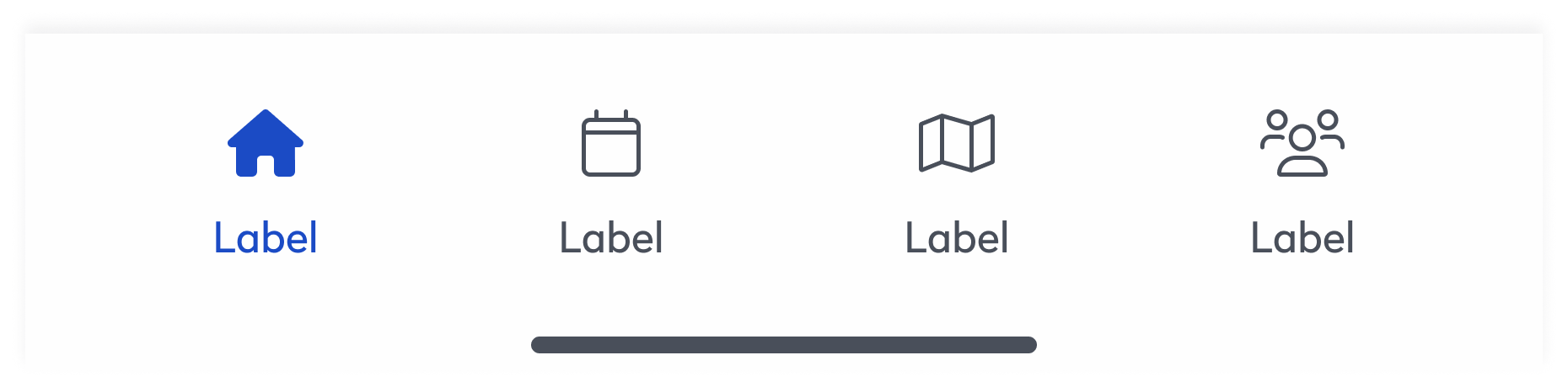
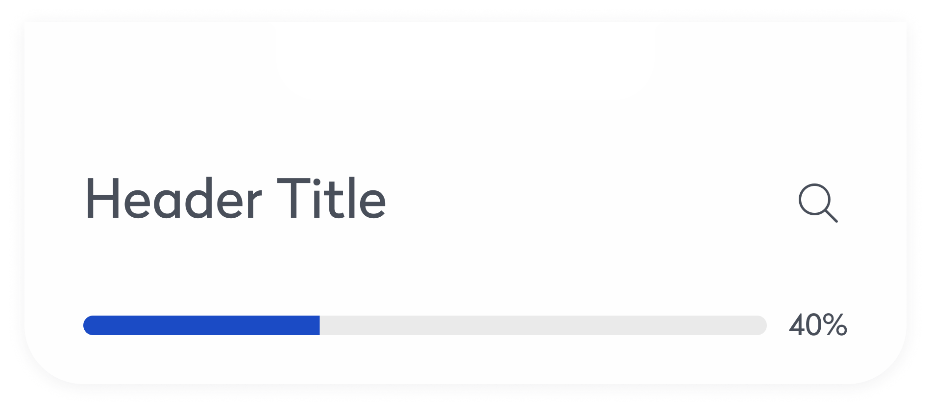
We introduced a unified component library to bring consistency across products and platforms. Core UI elements—such as buttons, cards, and inputs—were standardized, reducing visual discrepancies and design debt. For example, buttons that previously varied in style and behavior were consolidated into a flexible system, ensuring uniformity across mobile and desktop. This alignment improved accessibility, sped up design and development cycles, and allowed teams to focus more on solving user problems than rebuilding UI.
Performance Focused
Performance was a core focus throughout the system. High-traffic components like tabs were optimized for fast, seamless content switching through minimal DOM updates and conditional rendering. The search experience was enhanced with debounced inputs and lightweight logic, ensuring instant results even in data-heavy environments. Additionally, components like the accordion were restructured to render content only when expanded, reducing page load and improving efficiency across complex layouts. These improvements collectively contributed to a smoother, faster user experience across the product suite.
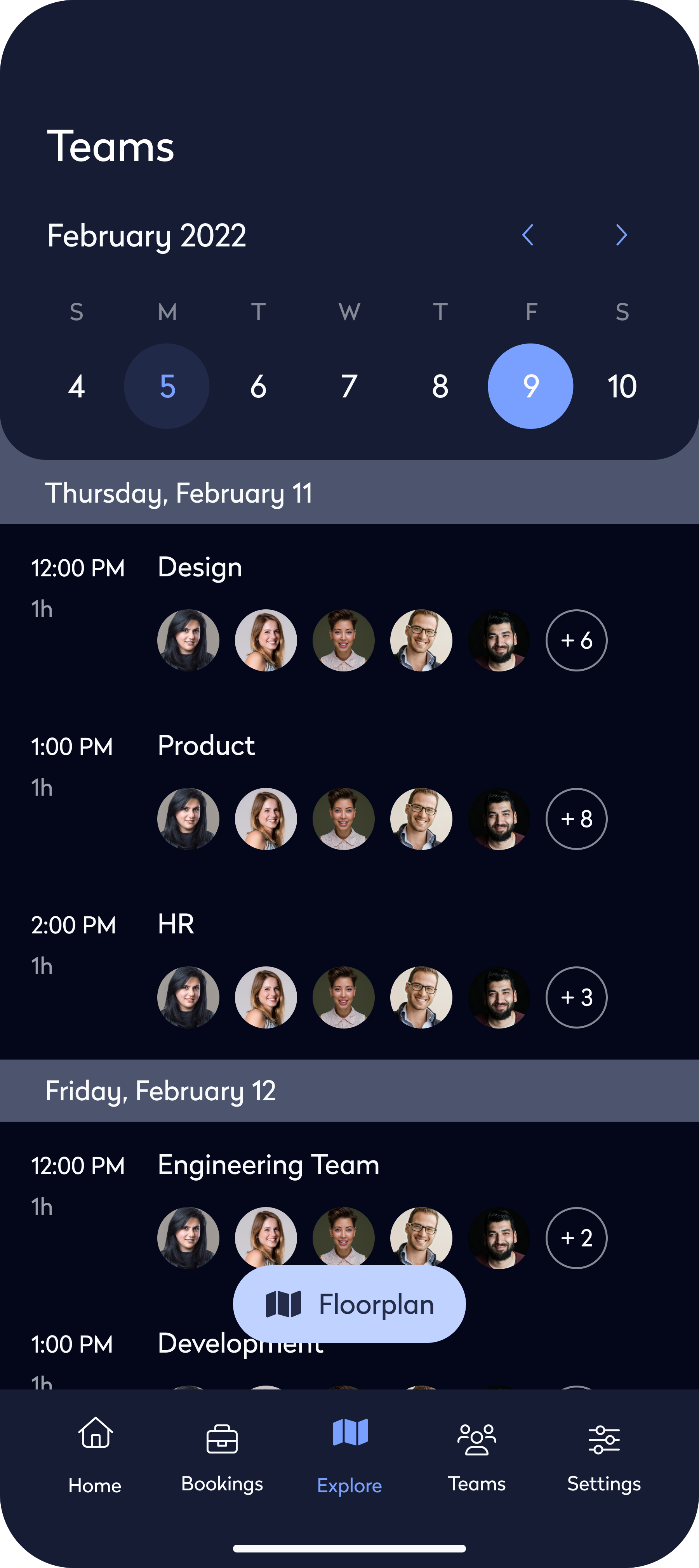
Streamlined Teamwork
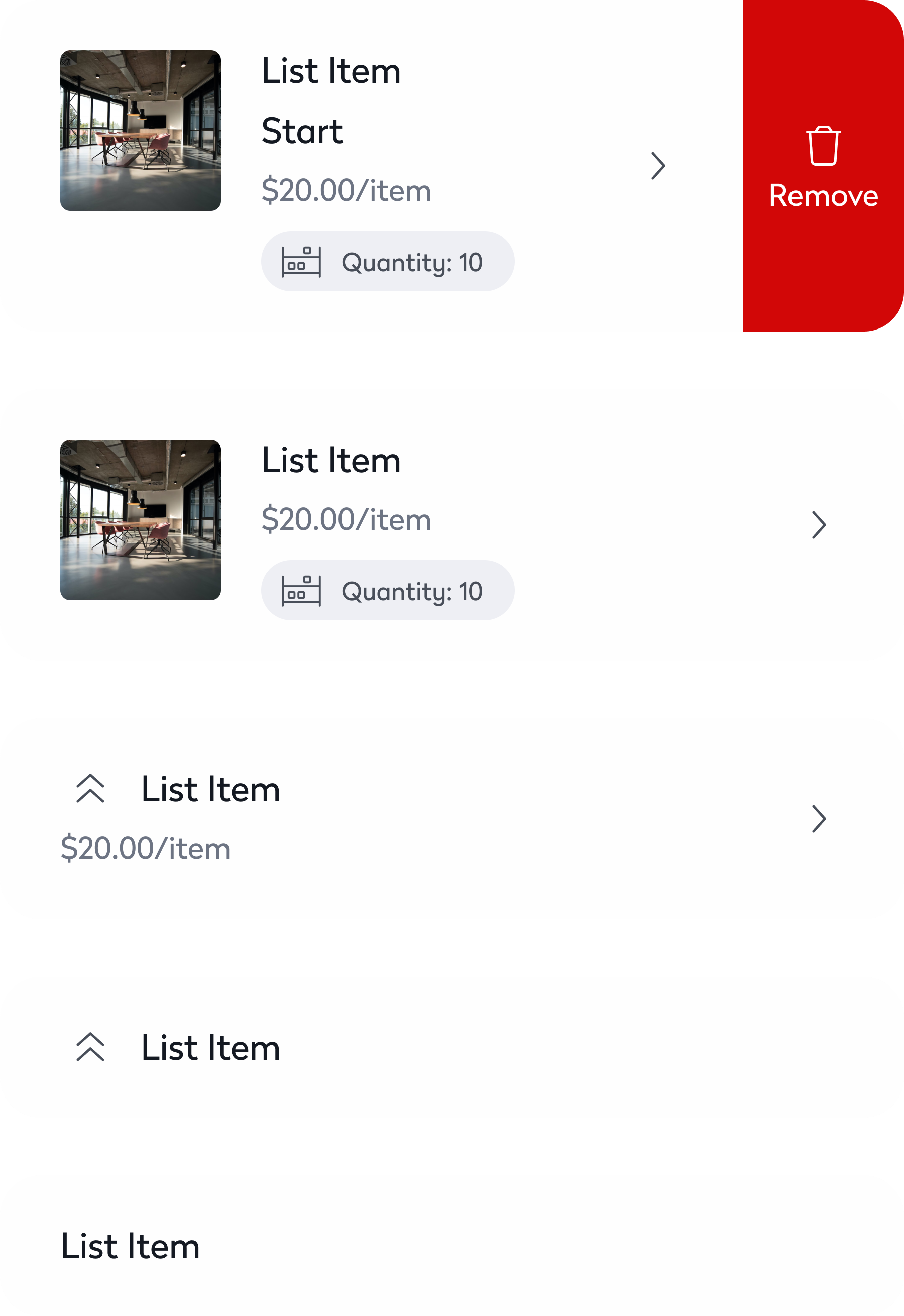
Evo established a single source of truth that connected design and engineering through a shared library of documented components. Engineers could quickly access and implement pre-built UI, reducing back-and-forth and cutting development time. For example, complex elements like interactive list items, dynamic navigation bars, and responsive footers were readily available—making it easier to maintain consistency and ship features faster.


Outcome
Design Standardization
The introduction of a unified library of UI components ensured consistency across all products, eliminating design discrepancies and creating a cohesive user experience.
Streamlined Collaboration
By providing a shared design language, Evo fostered better alignment between designers and engineers, reducing redundancies and speeding up the development process.
Improved Accessibility
Evo incorporated accessibility-first principles, automating testing and compliance checks, which reduced manual effort and ensured inclusivity in every design.
Powering Scalable, Accessible & Unified Product Design
Background
Eptura faced challenges with fragmented design practices and inconsistent user experiences across its platforms. Designers and engineers often worked in silos, leading to inefficiencies and misalignment.
Overview
Evo was created to unify teams under a shared system. It streamlined workflows, improved accessibility, and brought consistency across platforms. This case study shows how Evo accelerated development and improved collaboration.
Evo Design System

Problem
Where Teams Struggle Most
Inconsistency
Users encountered drastically different interfaces and behaviors across platforms, damaging trust and brand cohesion.
Duplication
Teams frequently rebuilt the same UI components from scratch across different products, wasting time and creating inefficiencies.
Misalignment
Designers and engineers operated in disconnected systems, leading to misalignment and delayed delivery.
Fragmented Ecosystem Slowed Growth
With nine digital products built on a patchwork of frameworks—ranging from React and Angular to ColdFusion and Xamarin—the organization lacked a consistent UX foundation. Design patterns were inconsistently applied, components were rebuilt from scratch, and brand experiences varied across platforms.
Operational Inefficiency Hurt Velocity
Without a centralized design system, teams struggled to ship consistently and quickly. UX decisions were often reactive rather than strategic, leading to costly redesigns and rework. As support tickets mounted and development cycles grew longer, it became clear that a scalable, unified solution was needed.
Solution
Creating a Shared Design Language
Built-in Accessibility
Accessibility was embedded from the start, with every component built to meet WCAG 2.1 AA standards. Color tokens were designed with proper contrast ratios across both light and dark themes, typography followed scalable and legible guidelines, and icons included descriptive labels for screen readers. Semantic markup and full keyboard navigation were baked into every pattern. Automated accessibility testing was integrated into the workflow to catch issues early, reducing reliance on manual audits and making it easier to consistently ship inclusive, accessible features.
Consistent Design Elements
We introduced a unified component library to bring consistency across products and platforms. Core UI elements—such as buttons, cards, and inputs—were standardized, reducing visual discrepancies and design debt. For example, buttons that previously varied in style and behavior were consolidated into a flexible system, ensuring uniformity across mobile and desktop. This alignment improved accessibility, sped up design and development cycles, and allowed teams to focus more on solving user problems than rebuilding UI.
Performance Focused
Performance was a core focus throughout the system. High-traffic components like tabs were optimized for fast, seamless content switching through minimal DOM updates and conditional rendering. The search experience was enhanced with debounced inputs and lightweight logic, ensuring instant results even in data-heavy environments. Additionally, components like the accordion were restructured to render content only when expanded, reducing page load and improving efficiency across complex layouts. These improvements collectively contributed to a smoother, faster user experience across the product suite.
Streamlined Teamwork
Evo established a single source of truth that connected design and engineering through a shared library of documented components. Engineers could quickly access and implement pre-built UI, reducing back-and-forth and cutting development time. For example, complex elements like headers, avatars, dynamic navigation bars, and responsive footers were readily available—making it easier to maintain consistency and ship features faster.

Outcome
Solving Fragmentation with a Centralized Design System
Design Standardization
The introduction of a unified library of UI components ensured consistency across all products, eliminating design discrepancies and creating a cohesive user experience.
Streamlined Collaboration
By providing a shared design language, Evo fostered better alignment between designers and engineers, reducing redundancies and speeding up the development process.
Improved Accessibility
Evo incorporated accessibility-first principles, automating testing and compliance checks, which reduced manual effort and ensured inclusivity in every design.
Explore more work
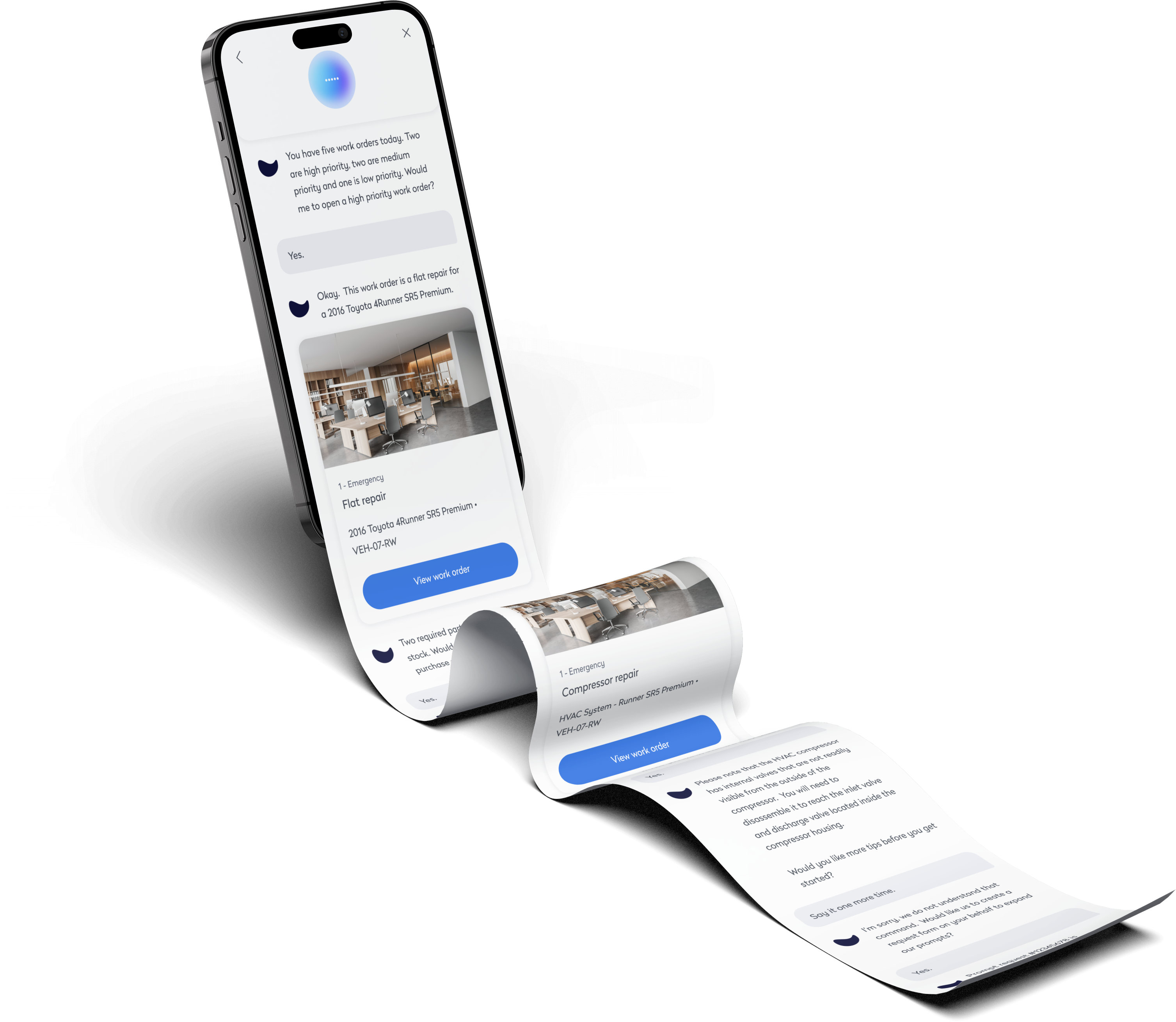
AI Technician Copilot
Voice-first UI for technicians to complete tasks hands-free. Fast, intuitive, and built for the field.
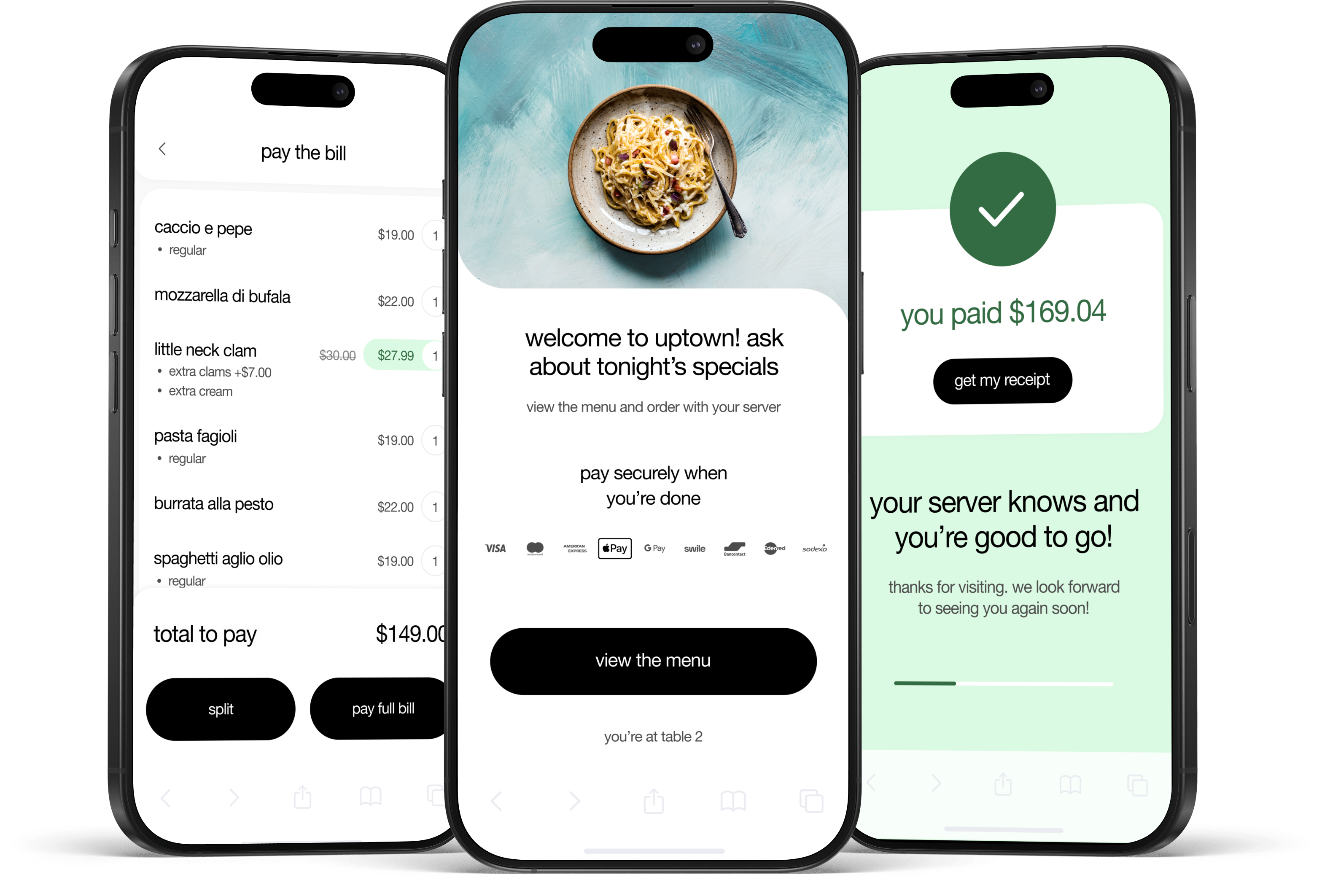
Pay at Table
Streamlined restaurant checkout with a tap-to-pay flow. Faster payments, higher tips, happier guests.

